

Project: Savage Soap
Product and Branding Identity System
Product and Branding Identity System
This is a branding sentence that works like this
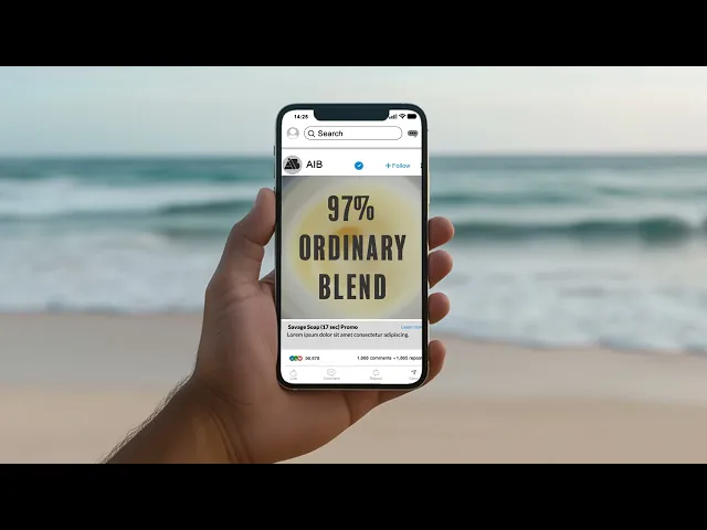
Savage Soap is a conceptual packaging project that explores raw energy through material, color, and expressive visual language. Designed as an artisan organic soap brand, the project targets a niche male audience by challenging traditional grooming aesthetics—replacing minimal neutrality with bold, emotionally charged compositions. Drawing inspiration from the raw, gestural energy of Jean-Michel Basquiat, the packaging incorporates layered mark-making, fragmented typography, and fluid color fields to create a sense of movement and intensity.
Each scent—Coastal Suds, Creamy Orange, and Lushy Lavender—is represented through distinct color narratives (blue, orange, violet), translating fragrance into visual atmosphere. The result is a system that feels both instinctive and refined—balancing organic flow with structured packaging design.
Beyond surface aesthetics, the project emphasizes physical production, integrating dieline construction and print execution to create a tangible object that embodies the brand’s identity. Savage Soap ultimately positions itself as a product that is not just functional, but expressive—transforming routine into ritual.
Savage Soap is a conceptual packaging project that explores raw energy through material, color, and expressive visual language. Designed as an artisan organic soap brand, the project targets a niche male audience by challenging traditional grooming aesthetics—replacing minimal neutrality with bold, emotionally charged compositions. Drawing inspiration from the raw, gestural energy of Jean-Michel Basquiat, the packaging incorporates layered mark-making, fragmented typography, and fluid color fields to create a sense of movement and intensity.
Each scent—Coastal Suds, Creamy Orange, and Lushy Lavender—is represented through distinct color narratives (blue, orange, violet), translating fragrance into visual atmosphere. The result is a system that feels both instinctive and refined—balancing organic flow with structured packaging design.
Beyond surface aesthetics, the project emphasizes physical production, integrating dieline construction and print execution to create a tangible object that embodies the brand’s identity. Savage Soap ultimately positions itself as a product that is not just functional, but expressive—transforming routine into ritual.
Services
brand system, Packaging Design, motion concept
Client
Savage Soap
Year
2026
credits
Packaging Concept, Branding design, and presentation direction
View other works
View Process

01: Soap Product

The visual identity of Art Field Social draws inspiration from agrarian landscapes viewed from above. Agricultural fields form geometric patterns of color, texture, and division, resembling a natural grid system. These patchwork compositions influenced the platform’s visual language, where each field symbolizes creative growth, collaboration, and the cultivation of artistic ideas within a connected community.
The visual identity of Art Field Social draws inspiration from agrarian landscapes viewed from above. Agricultural fields form geometric patterns of color, texture, and division, resembling a natural grid system. These patchwork compositions influenced the platform’s visual language, where each field symbolizes creative growth, collaboration, and the cultivation of artistic ideas within a connected community.
The visual identity of Art Field Social draws inspiration from agrarian landscapes viewed from above. Agricultural fields form geometric patterns of color, texture, and division, resembling a natural grid system. These patchwork compositions influenced the platform’s visual language, where each field symbolizes creative growth, collaboration, and the cultivation of artistic ideas within a connected community.
02: Logo


The logo was designed to maximize impact through simplicity. Using a condensed, heavyweight typeface, the wordmark creates a strong visual silhouette that is both modern and highly legible. Paired with expressive painted textures, bold color blocking, and generous negative space, the identity system allows each fragrance to develop its own personality while reinforcing a unified brand experience across packaging and digital platforms.
The logo was designed to maximize impact through simplicity. Using a condensed, heavyweight typeface, the wordmark creates a strong visual silhouette that is both modern and highly legible. Paired with expressive painted textures, bold color blocking, and generous negative space, the identity system allows each fragrance to develop its own personality while reinforcing a unified brand experience across packaging and digital platforms.
The logo was designed to maximize impact through simplicity. Using a condensed, heavyweight typeface, the wordmark creates a strong visual silhouette that is both modern and highly legible. Paired with expressive painted textures, bold color blocking, and generous negative space, the identity system allows each fragrance to develop its own personality while reinforcing a unified brand experience across packaging and digital platforms.
03: Graphical Layout

The Savage graphic system extends the brand through a structured yet expressive visual language. Bold typography, generous spacing, and a restrained neutral foundation create clarity, while vibrant accent colors distinguish each product variant. Hand-painted brushstrokes and gestural illustrations introduce energy and texture, reinforcing the handcrafted nature of the soap. Designed for consistency across packaging, web, and marketing materials, the system creates a cohesive identity that feels contemporary, artistic, and confidently bold.
The Savage graphic system extends the brand through a structured yet expressive visual language. Bold typography, generous spacing, and a restrained neutral foundation create clarity, while vibrant accent colors distinguish each product variant. Hand-painted brushstrokes and gestural illustrations introduce energy and texture, reinforcing the handcrafted nature of the soap. Designed for consistency across packaging, web, and marketing materials, the system creates a cohesive identity that feels contemporary, artistic, and confidently bold.
The Savage graphic system extends the brand through a structured yet expressive visual language. Bold typography, generous spacing, and a restrained neutral foundation create clarity, while vibrant accent colors distinguish each product variant. Hand-painted brushstrokes and gestural illustrations introduce energy and texture, reinforcing the handcrafted nature of the soap. Designed for consistency across packaging, web, and marketing materials, the system creates a cohesive identity that feels contemporary, artistic, and confidently bold.
04: Packaging Layout


The packaging structure was developed using a standardized dieline generated through TemplateMaker, allowing for accurate proportions and efficient assembly. This framework provided a foundation for translating the visual system onto a three-dimensional form, where each panel was intentionally composed to maintain continuity of pattern, typography, and gesture. The layout considers both flat and folded states—ensuring that the expressive surface graphics align seamlessly when constructed, while also functioning clearly as a retail-facing product.
The packaging structure was developed using a standardized dieline generated through TemplateMaker, allowing for accurate proportions and efficient assembly. This framework provided a foundation for translating the visual system onto a three-dimensional form, where each panel was intentionally composed to maintain continuity of pattern, typography, and gesture. The layout considers both flat and folded states—ensuring that the expressive surface graphics align seamlessly when constructed, while also functioning clearly as a retail-facing product.
The packaging structure was developed using a standardized dieline generated through TemplateMaker, allowing for accurate proportions and efficient assembly. This framework provided a foundation for translating the visual system onto a three-dimensional form, where each panel was intentionally composed to maintain continuity of pattern, typography, and gesture. The layout considers both flat and folded states—ensuring that the expressive surface graphics align seamlessly when constructed, while also functioning clearly as a retail-facing product.
05: Posters
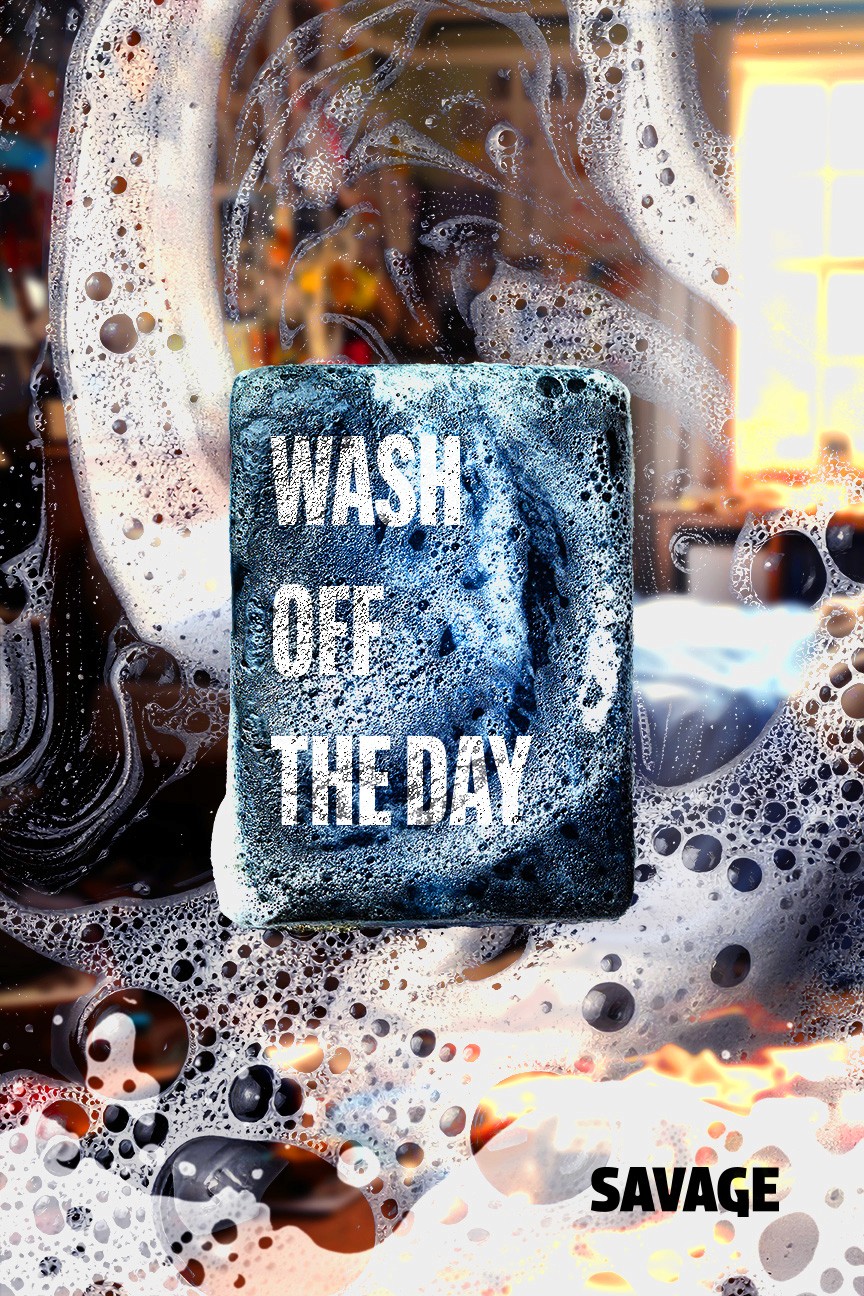


Wash Off The Day positions Savage Soap as a tool for personal reset—removing not just physical residue, but the accumulation of daily experience. Set across three environments—domestic, industrial, and natural—the campaign frames dirt, sweat, and atmosphere as something carried on the body. The soap becomes a point of transformation, shifting chaos into clarity through ritual.
Wash Off The Day positions Savage Soap as a tool for personal reset—removing not just physical residue, but the accumulation of daily experience. Set across three environments—domestic, industrial, and natural—the campaign frames dirt, sweat, and atmosphere as something carried on the body. The soap becomes a point of transformation, shifting chaos into clarity through ritual.
Wash Off The Day positions Savage Soap as a tool for personal reset—removing not just physical residue, but the accumulation of daily experience. Set across three environments—domestic, industrial, and natural—the campaign frames dirt, sweat, and atmosphere as something carried on the body. The soap becomes a point of transformation, shifting chaos into clarity through ritual.
06: Promo Video
