
Project: NACA
Product and Branding Identity System: Native American Cultural Apparel
Product and Branding Identity System: Native American Cultural Apparel
NACA envisions a design practice where meaning is translated into form, fostering awareness, relationship, and return.
NACA envisions a design practice where meaning is translated into form, fostering awareness, relationship, and return.
This project explores the visual and symbolic relationship between animals and Native American cultural traditions through a contemporary graphic design lens. Inspired by the structural rhythm of totem pole carvings and Indigenous storytelling traditions, I developed a series of stylized animal icons representing symbolic spirit animals including the bear, wolf, rabbit, deer, beaver, and horse. The icons were designed using simplified geometric forms and symmetrical compositions to echo the vertical visual language commonly found in carved totems and symbolic animal figures.
This project explores the visual and symbolic relationship between animals and Native American cultural traditions through a contemporary graphic design lens. Inspired by the structural rhythm of totem pole carvings and Indigenous storytelling traditions, I developed a series of stylized animal icons representing symbolic spirit animals including the bear, wolf, rabbit, deer, beaver, and horse. The icons were designed using simplified geometric forms and symmetrical compositions to echo the vertical visual language commonly found in carved totems and symbolic animal figures.
Services
UX/UI design, brand system, motion concept
Client
United Native American Association
Year
2026
Credits
Concept, design, and presentation direction
View other works
View Process

01: Inspiration
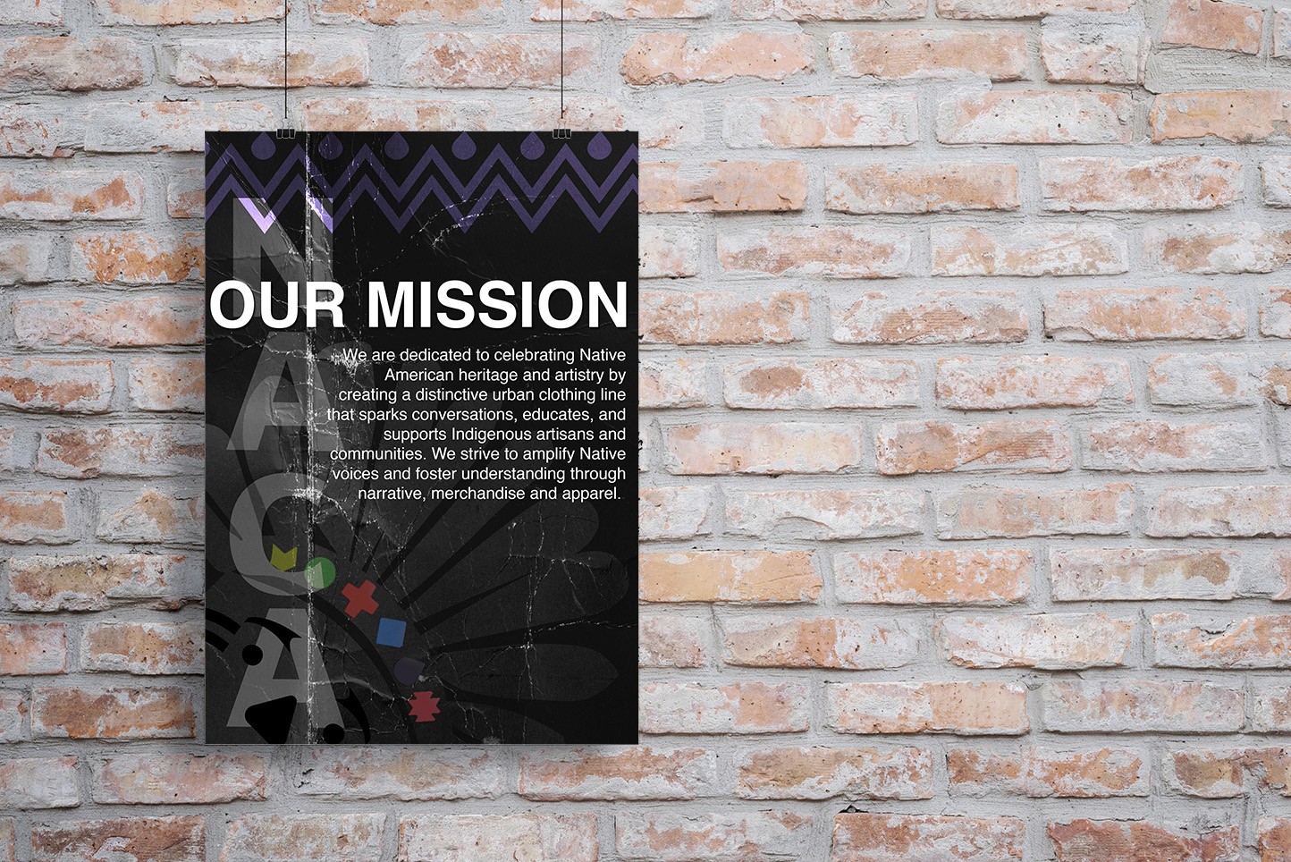
NACA is a branding campaign rooted in cultural respect and personal identity. As a Native American designer, I used this project to explore my own heritage while creating a contemporary visual system that celebrates Indigenous culture. The goal was to build awareness through thoughtful design, using apparel and storytelling as a platform to honor Native voices, inspire conversation, and bridge the connection between tradition and modern culture.
NACA is a branding campaign rooted in cultural respect and personal identity. As a Native American designer, I used this project to explore my own heritage while creating a contemporary visual system that celebrates Indigenous culture. The goal was to build awareness through thoughtful design, using apparel and storytelling as a platform to honor Native voices, inspire conversation, and bridge the connection between tradition and modern culture.
NACA is a branding campaign rooted in cultural respect and personal identity. As a Native American designer, I used this project to explore my own heritage while creating a contemporary visual system that celebrates Indigenous culture. The goal was to build awareness through thoughtful design, using apparel and storytelling as a platform to honor Native voices, inspire conversation, and bridge the connection between tradition and modern culture.
02: Logo


The NACA logo merges a contemporary wordmark with a stylized Indigenous figure to create an identity that celebrates Native American heritage through modern design. The simplified geometry ensures versatility across print, digital, and apparel applications, while the accompanying symbolic color system references traditional beadwork, storytelling, and the diversity of Indigenous cultures.
The NACA logo merges a contemporary wordmark with a stylized Indigenous figure to create an identity that celebrates Native American heritage through modern design. The simplified geometry ensures versatility across print, digital, and apparel applications, while the accompanying symbolic color system references traditional beadwork, storytelling, and the diversity of Indigenous cultures.
The NACA logo merges a contemporary wordmark with a stylized Indigenous figure to create an identity that celebrates Native American heritage through modern design. The simplified geometry ensures versatility across print, digital, and apparel applications, while the accompanying symbolic color system references traditional beadwork, storytelling, and the diversity of Indigenous cultures.
03: Graphical Layout

The NACA graphic system expands the brand through bold typography, Native-inspired illustrations, and a flexible color palette. Designed for consistency across multiple touchpoints, the visual language balances cultural symbolism with contemporary minimalism, creating a cohesive identity that reflects community, craftsmanship, and cultural pride.
The NACA graphic system expands the brand through bold typography, Native-inspired illustrations, and a flexible color palette. Designed for consistency across multiple touchpoints, the visual language balances cultural symbolism with contemporary minimalism, creating a cohesive identity that reflects community, craftsmanship, and cultural pride.
The NACA graphic system expands the brand through bold typography, Native-inspired illustrations, and a flexible color palette. Designed for consistency across multiple touchpoints, the visual language balances cultural symbolism with contemporary minimalism, creating a cohesive identity that reflects community, craftsmanship, and cultural pride.
04: Clothing Label

05: Merch


06: Pop-Up Store


