

Project: Minigrub
Branding Identity System
Minigrub normalizes sustainable insect-based food through design and culture. It makes new food systems approachable and engaging.
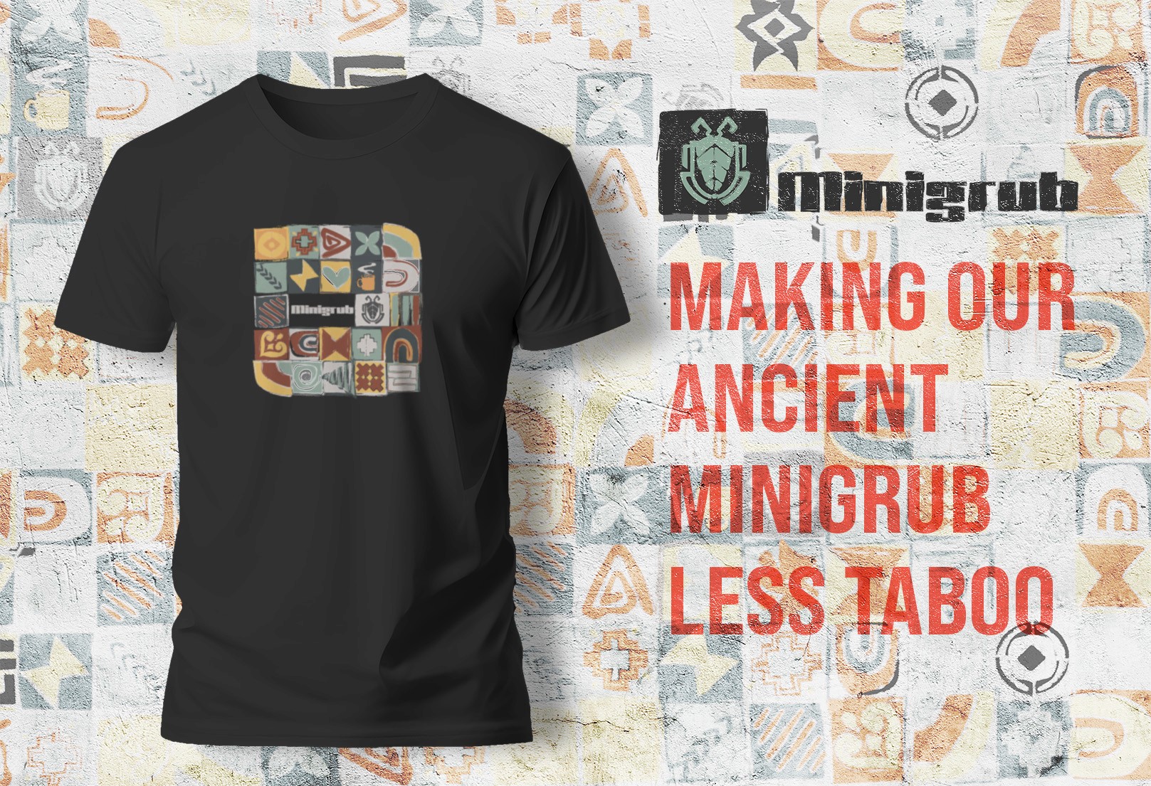
The Minigrub Project is a brand development exercise focused on creating a cohesive visual identity for a food-related product or service that emphasizes accessibility, personality, and memorable design. The project begins with foundational branding elements—including a brand name, logo system, typography, and color palette—which establish the visual language of the brand. From these core components, the project expands into a multi-platform branding system that demonstrates how the identity functions across print, merchandise, and digital environments.
[ Tool Kit ]
Services
brand identity, brand system, promotional deliverables
Client
Minigrub
Year
2025
Credits
Concept, design, and presentation direction
View other works
View Process
01: Inspiration: The theme of cultural practice and suplimentational benefits of Entomophagy

OpenAI. (2026). AI-generated image depicting the cultural practice of entomophagy [AI-generated image]. ChatGPT (GPT-5.5). https://chatgpt.com/
Bring a Trailer’s new look is playful and energetic, using bold shapes and scale to reflect the fun community vibe. The key element is the logo split in half, symbolizing connection and togetherness.
02: Logo


Minigrub is a conceptual branding project that explores how thoughtful visual design can reshape public perception of edible insects. Through a custom logo, handcrafted typography, and an adaptable graphic system, the identity presents insect protein as an inviting, sustainable alternative while creating a memorable and cohesive brand experience.
03: Graphical Layout

04: Product Label Design

The label adopts a restrained typographic system and structured grid to communicate familiarity, credibility, and trust. Inspired by modern coffee roasters, laboratory labeling, and agricultural export packaging, the design replaces novelty with confidence, allowing the product's origin and sustainability story to become the primary visual focus.
05: Product Infographic

Created as part of the MiniGrub brand, this infographic uses storytelling, data visualization, and bold visual hierarchy to educate audiences about insects as a sustainable alternative protein source while highlighting their environmental advantages.
06: Web Design


07: Flagship Restaurant/Store


Project: Minigrub
Branding Identity System
Minigrub normalizes sustainable insect-based food through design and culture. It makes new food systems approachable and engaging.
The Minigrub Project is a brand development exercise focused on creating a cohesive visual identity for a food-related product or service that emphasizes accessibility, personality, and memorable design. The project begins with foundational branding elements—including a brand name, logo system, typography, and color palette—which establish the visual language of the brand. From these core components, the project expands into a multi-platform branding system that demonstrates how the identity functions across print, merchandise, and digital environments.
[ Tool Kit ]
Services
brand identity, brand system, promotional deliverables
Client
Minigrub
Year
2025
Credits
Concept, design, and presentation direction
Project: Minigrub
Branding Identity System
Minigrub normalizes sustainable insect-based food through design and culture. It makes new food systems approachable and engaging.
The Minigrub Project is a brand development exercise focused on creating a cohesive visual identity for a food-related product or service that emphasizes accessibility, personality, and memorable design. The project begins with foundational branding elements—including a brand name, logo system, typography, and color palette—which establish the visual language of the brand. From these core components, the project expands into a multi-platform branding system that demonstrates how the identity functions across print, merchandise, and digital environments.
Social
01: Inspiration: The theme of cultural practice and suplimentational benefits of Entomophagy
OpenAI. (2026). AI-generated image depicting the cultural practice of entomophagy [AI-generated image]. ChatGPT (GPT-5.5). https://chatgpt.com/
Bring a Trailer’s new look is playful and energetic, using bold shapes and scale to reflect the fun community vibe. The key element is the logo split in half, symbolizing connection and togetherness.
04: Product Label Design
The label adopts a restrained typographic system and structured grid to communicate familiarity, credibility, and trust. Inspired by modern coffee roasters, laboratory labeling, and agricultural export packaging, the design replaces novelty with confidence, allowing the product's origin and sustainability story to become the primary visual focus.
02: Logo
Minigrub is a conceptual branding project that explores how thoughtful visual design can reshape public perception of edible insects. Through a custom logo, handcrafted typography, and an adaptable graphic system, the identity presents insect protein as an inviting, sustainable alternative while creating a memorable and cohesive brand experience.
03: Graphical Layout
05: Product Infographic
Created as part of the MiniGrub brand, this infographic uses storytelling, data visualization, and bold visual hierarchy to educate audiences about insects as a sustainable alternative protein source while highlighting their environmental advantages.
06: Web Design
07: Flagship Restaurant/Store
01: Inspiration: The theme of cultural practice and suplimentational benefits of Entomophagy
OpenAI. (2026). AI-generated image depicting the cultural practice of entomophagy [AI-generated image]. ChatGPT (GPT-5.5). https://chatgpt.com/
Bring a Trailer’s new look is playful and energetic, using bold shapes and scale to reflect the fun community vibe. The key element is the logo split in half, symbolizing connection and togetherness.
02: Logo
Minigrub is a conceptual branding project that explores how thoughtful visual design can reshape public perception of edible insects. Through a custom logo, handcrafted typography, and an adaptable graphic system, the identity presents insect protein as an inviting, sustainable alternative while creating a memorable and cohesive brand experience.
03: Graphical Layout
04: Product Label Design
The label adopts a restrained typographic system and structured grid to communicate familiarity, credibility, and trust. Inspired by modern coffee roasters, laboratory labeling, and agricultural export packaging, the design replaces novelty with confidence, allowing the product's origin and sustainability story to become the primary visual focus.
05: Product Infographic
Created as part of the MiniGrub brand, this infographic uses storytelling, data visualization, and bold visual hierarchy to educate audiences about insects as a sustainable alternative protein source while highlighting their environmental advantages.
06: Web Design
07: Flagship
Restaurant/Store